Page 1 of 3
Ultra Kaks!
Posted: 10 Jul 2009, 20:25
by Kaka
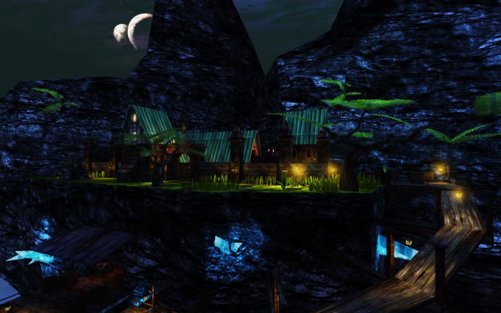
Just a picture to show I'm working on a contest map too :
Posted: 10 Jul 2009, 20:28
by Buff Skeleton
Wow, vibrant colors! This is gonna be good (obviously; it's Kaka!).
Edit: I mean it's Kaks! Ultra Kaks!
Posted: 10 Jul 2009, 21:55
by UB_
Nice archi but way too colourful for my taste.
Posted: 10 Jul 2009, 23:03
by Lightning Hunter
UBerserker wrote:Nice archi but way too colourful for my taste.
I sometimes don't like colors this vibrant either, but I think in this case it makes the setup look more magical. If Kaka can pull it off using that much color, then I can't wait to play this.

Posted: 10 Jul 2009, 23:20
by Hellscrag
Nice pic. But you will need to make those trees available for download, unless you have made them for this contest.
Posted: 10 Jul 2009, 23:25
by Buff Skeleton
Pretty sure those are BSP trees, actually

It looks like it, at least.
[Edit] Wait no what the hell am I thinking, there's no way the engine wouldn't completely shit itself if those were BSP, let alone light them properly
Posted: 10 Jul 2009, 23:28
by Kaka
I've made them for the contest, along with everything new in that pic

. They are meshes btw
Posted: 10 Jul 2009, 23:30
by Hellscrag
Kaka wrote:I've made them for the contest, along with everything new in that pic
. They are meshes btw
Then nice work!
Posted: 11 Jul 2009, 00:02
by Legendslayer222
I love the use of colours. It's like food for my eyes (& it tastes good).

Posted: 11 Jul 2009, 01:33
by Sarevok
I like the lighting, I just think the colors are to strong. Maybe raise the saturation 20 units are so...the blue seems to overpower everything.
Posted: 11 Jul 2009, 03:06
by gp
Nice!
Posted: 11 Jul 2009, 10:19
by MartinW
Wow, someone said magical. That's the right term to use here. Don't reduce the colors' intensity, the strong colors are what helps to create that distinct feeling of a tropical place, a warm summer night somewhere in a hidden and sacred corner on Na'Pali. A safe haven.
Mappers too often try to get the lighting too mundane (they don't try to get it to look mundane but that's what they get ... including me, I whish that screenshot came from me).
Posted: 11 Jul 2009, 10:24
by UB_
Magical or not, I can't stand them. I'll have to desaturate my screen when playing this.
Posted: 11 Jul 2009, 12:24
by Hellscrag
UBerserker wrote:Magical or not, I can't stand them. I'll have to desaturate my screen when playing this.
My advice would be, don't prejudge the map. Play it as the mapper intended it, and then rate the lighting afterwards.
Posted: 11 Jul 2009, 22:09
by Sarevok
Screenshots can be misleading sometimes, I think it'll look better in game.